on
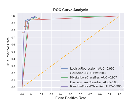
Drawing multiple ROC-Curves in a single plot
What is AUC-ROC Curve?
AUC-ROC curve is a performance metric for binary classification problem at different thresholds. ROC is a probability curve and AUC represents the degree or measure of separability. It tells how much model is capable of distinguishing between classes. Higher the AUC, better the model is at predicting 0s as 0s and 1s as 1s.
The ROC curve is plotted with False Positive Rate in the x-axis against the True Positive Rate in the y-axis.
You may face such situations when you run multiple models and try to plot the ROC-Curve for each model in a single figure. Plotting multiple ROC-Curves in a single figure makes it easier to analyze model performances and find out the best performing model.
Let’s begin. We’ll use Pandas, Numpy, Matplotlib, Seaborn and Scikit-learn to accomplish this task.
Importing the necessary libraries
import pandas as pd
import numpy as np
%matplotlib inline
import matplotlib.pyplot as plt
import seaborn as sns
sns.set()

import warnings
warnings.filterwarnings('ignore')
Loading a toy Dataset from sklearn
from sklearn import datasets
from sklearn.model_selection import train_test_split

data = datasets.load_breast_cancer()

X = data.data
y = data.target

X_train, X_test, y_train, y_test = train_test_split(X, y,
                                                    test_size=.25,
                                                    random_state=1234)
Training multiple classifiers and recording the results
In this phase we’ll perform a few steps:
- Instantiate the classifiers and make a list
- Define a result table as a DataFrame
- Train the models and record the results
Here, we’ll train the models on the training set and predict the probabilities on the test set. After predicting the probabilities, we’ll calculate the False positive rates, True positive rate, and AUC scores.
# Import the classifiers
from sklearn.linear_model import LogisticRegression
from sklearn.naive_bayes import GaussianNB
from sklearn.neighbors import KNeighborsClassifier
from sklearn.tree import DecisionTreeClassifier
from sklearn.ensemble import RandomForestClassifier

from sklearn.metrics import roc_curve, roc_auc_score

# Instantiate the classfiers and make a list
classifiers = [LogisticRegression(random_state=1234),
               GaussianNB(),
               KNeighborsClassifier(),
               DecisionTreeClassifier(random_state=1234),
               RandomForestClassifier(random_state=1234)]

# Define a result table as a DataFrame
result_table = pd.DataFrame(columns=['classifiers', 'fpr','tpr','auc'])

# Train the models and record the results
for cls in classifiers:
    model = cls.fit(X_train, y_train)
    yproba = model.predict_proba(X_test)[::,1]

    fpr, tpr, _ = roc_curve(y_test,  yproba)
    auc = roc_auc_score(y_test, yproba)

    result_table = result_table.append({'classifiers':cls.__class__.__name__,
                                        'fpr':fpr,
                                        'tpr':tpr,
                                        'auc':auc}, ignore_index=True)

# Set name of the classifiers as index labels
result_table.set_index('classifiers', inplace=True)
Plot the figure
fig = plt.figure(figsize=(8,6))

for i in result_table.index:
    plt.plot(result_table.loc[i]['fpr'],
             result_table.loc[i]['tpr'],
             label="{}, AUC={:.3f}".format(i, result_table.loc[i]['auc']))

plt.plot([0,1], [0,1], color='orange', linestyle='--')

plt.xticks(np.arange(0.0, 1.1, step=0.1))
plt.xlabel("Flase Positive Rate", fontsize=15)

plt.yticks(np.arange(0.0, 1.1, step=0.1))
plt.ylabel("True Positive Rate", fontsize=15)

plt.title('ROC Curve Analysis', fontweight='bold', fontsize=15)
plt.legend(prop={'size':13}, loc='lower right')

plt.show()
Output:

Use the following code to export the figure.
fig.savefig('multiple_roc_curve.png')